
Most companies know which products sell. Far fewer know which customers make them money.
Revenue is easy to see for each customer. It’s on every invoice. But the costs are harder to see. Some hospitals call support every week, some order a pallet at a time, and others want a technician on site. None of that shows up on an invoice, but all of it costs money. Spread those costs evenly and every customer looks fine. Trace them back to whoever caused them, and the picture can change completely.
In Data Driven Management Accounting at BI, the exam asked us to build a company from scratch where this matters, invent all its data, and find out what happens. Here’s what I built.
The company
I made up a supplier of medical equipment with 50 hospitals as customers. It sells four products:
- Surgical kits at $10,000 each
- Diagnostic equipment at $50,000
- Patient monitors at $20,000
- Boxes of gloves at $10
Medical supplies are a good industry for this. The products are fairly cheap to make, but expensive to handle. Everything has to be sterilised, equipment has to be calibrated, and it all has to be packed, stored and shipped to hospitals.
The company makes $100 million a year. Making the products costs $25 million, and $65 million goes to everything else: handling, service and delivery. That leaves $10 million in profit. On paper it’s a healthy business.
Following the hidden costs
The usual way to share out that $65 million is to spread it evenly, for example by revenue. A customer who buys 5% of the goods gets 5% of the costs. It’s simple, but it hides where the money actually goes.
The method we learned, activity-based costing, asks a better question: what actually causes each cost? I split the $65 million into four activities and gave each one a measure of how much work it takes:
- Sterilisation and quality control, counted in sterilisation cycles, at $1,000 per cycle
- Calibration, counted in test runs, at $2,000 per run
- Packaging, counted in minutes of packing work
- Storage and shipping, counted in shipments
Each activity gets a price per unit of work, found by dividing what the activity costs in a year by how much work it does. For sterilisation, $4.5 million a year spread over 4,500 cycles:
Each product then pays for the activities it actually uses. On top of that, some costs belong to a customer, not a product. Every hospital calls for support (charged at $150 an hour) and gets visits from service staff ($500 per hour on site), and each one gets charged for its own.
The product that looked fine
Before the handling costs, gloves look like a good product. They bring in $25 million, cost $9 million to make, and leave $16 million in margin, just as much as the patient monitors.
But the company sells 2.5 million boxes of gloves. Every single box has to be packed, stored and shipped, and at that volume those costs explode:
One box of gloves, in dollars
View data
Each box sells for $10 but costs $26.20 once packing and shipping are counted:
The company loses $16.20 on every box it sells, and across 2.5 million boxes that adds up to a loss of $40.5 million:
Profit per product, in million dollars
View data
The equipment earns the money, and the gloves quietly give most of it back.
The customers
Since every hospital buys a different mix, the customers turn out very different too. When I added up each hospital’s products and its own service costs, 31 hospitals made the company money and 19 lost it money:
Profit per customer, in million dollars
View data
The pattern is clear. The more gloves a hospital buys, the worse it looks. The biggest loss-maker buys almost 150,000 boxes of gloves a year, and serving it costs the company about $2 million more than it pays.
The whale curve
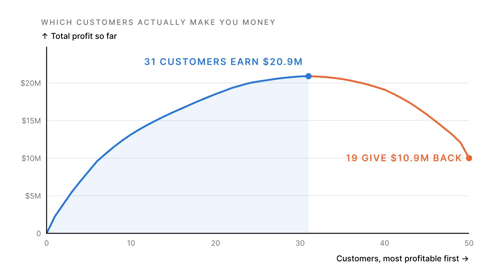
There’s a neat way to see all of this in one picture. Sort the customers from the most to the least profitable, then add up the profit as you go, one customer at a time. In accounting this is called a Stobachoff curve, and because of its shape it’s often nicknamed the whale curve:
Total profit as each customer is added
View data
The curve rises quickly with the best customers and flattens out. It peaks after customer 31, at $20.9 million, and then falls for every one of the last 19 until it lands at the real profit of $10 million.
The size of that drop has its own number, the Stobachoff coefficient. It’s the losses divided by the profits: $10.9 million lost to bad customers against $20.9 million earned from good ones. You can also read it straight off the curve, as the drop from the top divided by the height of the top. Both ways give the same answer:
Either way, it means the company hands back 52 cents of every dollar its good customers earn.
It gets even more lopsided at the top. The ten best customers, a fifth of the list, earn $13.2 million on their own. That’s more than the whole company’s profit.
So what should the company do?
The obvious answer is to drop the 19 bad customers. But it isn’t that simple.
- Gloves may be the way in. A hospital might buy gloves from you because it buys equipment from you, or the other way round. Drop the gloves and you might lose the equipment orders too.
- Not every cost disappears. The warehouse and the packing staff don’t vanish the day a customer leaves. Some of the costs would stay behind and have to be carried by everyone else.
The better question is what drives the cost, because that’s where to push. Gloves are expensive because every box is handled on its own. Bigger orders with fewer shipments, a delivery fee, a higher price on gloves, or bundling them with the equipment would all go straight at the cause.
What I take from it
- Revenue tells you very little about a customer. What it costs to serve them matters just as much.
- A product can look great on margin and still lose money. Gloves had the same margin as patient monitors before the handling costs were counted.
- One curve says a lot. The whale curve shows in a single glance how much profit a company earns and how much it gives away.
About the paper
This is based on my exam in Data Driven Management Accounting (EBA3630) at BI Norwegian Business School, spring 2025. The company and all its numbers are made up, which the exam required, and I built the model in Excel.
In the exam, I drew the curve but didn’t include the Stobachoff coefficient, so I worked it out for this article. I also fixed a small mistake from the exam, where the customer service costs were subtracted twice. Correcting it doesn’t change the picture: there are still 19 loss-making customers and the curve still peaks after 31, but the customers now add up to the company’s real profit of $10 million.
[SYS.03 // ADVISORY.OPEN]
Stuck on a hard technical problem? Maybe I can help.
I take on the occasional advisory job, custom software architecture and research collaboration. There's no sales funnel. You write to me and I answer.
NP // NORDICPRODUCTIONS.NO