
Bearproof Precision: Sales Landing Page
A long-form sales page for a single product on salg.bearproof.no, built to turn Facebook traffic into orders in the Bearproof web store.

Why a separate page
Bearproof.no is a full hunting store. Rifles, optics, clothing and dog gear all sit side by side, which is great if you’re browsing. But in autumn 2020 we wanted to sell one thing: Bearproof Precision.
Bearproof Precision is a small cushion that attaches to the stock of a rifle with Velcro. It raises your cheek to the right height, so your eye lines up with the scope every time you aim. You don’t have to drill, glue or change the rifle at all.
If we had sent people from the Facebook ads straight into the store, they would have landed among hundreds of other products. So Bearproof Precision got a page of its own, salg.bearproof.no (“salg” means sale), with one product, one story and one button. When someone is ready to buy, the button takes them to the product in the store, where they check out as usual.
This page was one part of a bigger campaign that also included a store redesign and the Facebook ads. You can read about that in Bearproof: ~60% Revenue Growth Case.
A letter, not a product page
Most hunters had never heard of this kind of product. A photo, a price and a buy button wouldn’t have been enough. So instead of a normal product page, I wrote the page like a long letter that answers the questions a buyer has, one at a time, in the order they come up:
- What is this, and why should I care?
- Who’s behind it, and can I trust them?
- Why not buy something else?
- Is it hard to put on?
- What if it doesn’t work for me?
Here’s how the page answers each one.
1. What is this?
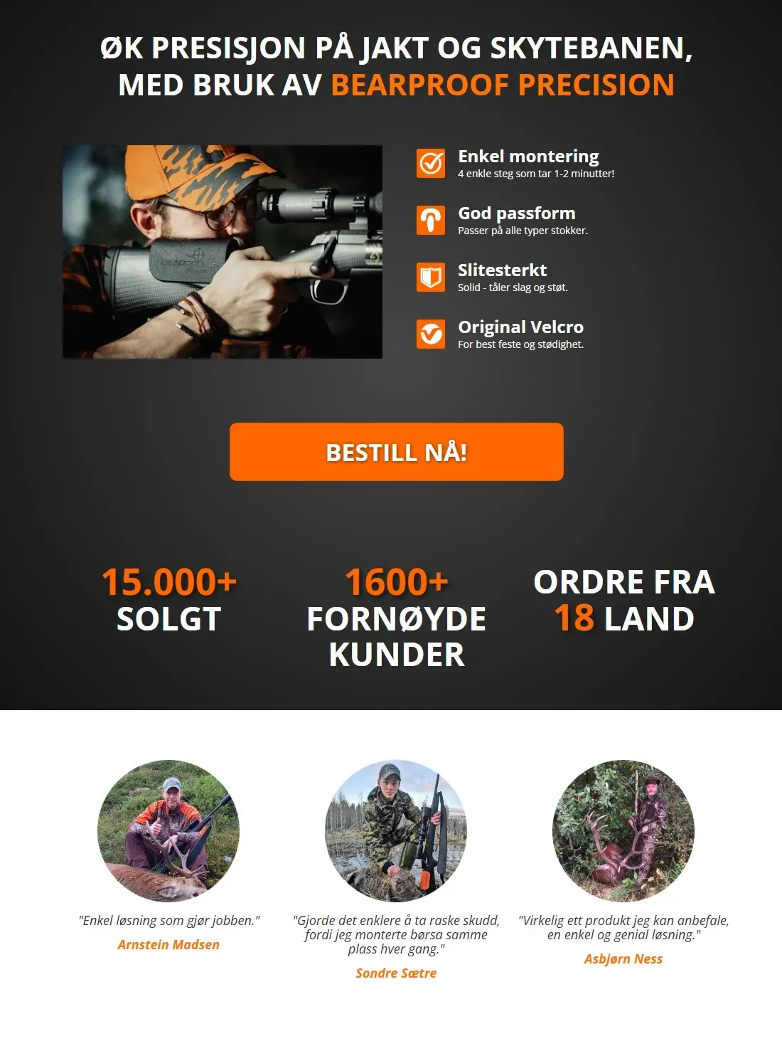
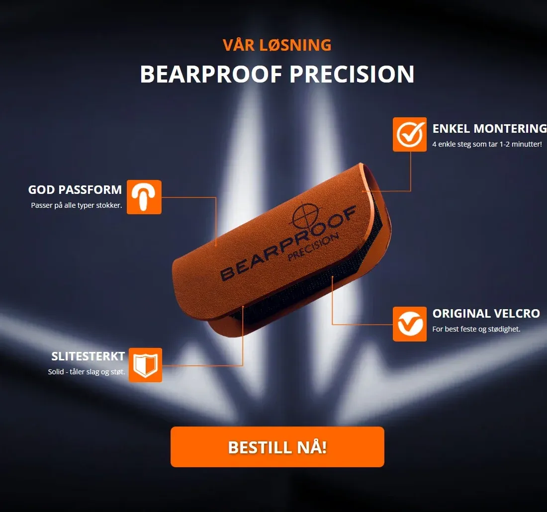
The top of the page makes one promise: “Øk presisjon på jakt og skytebanen”, better precision when hunting and at the shooting range. Next to it is a photo of the product on a rifle, with four short reasons to care: it’s easy to put on, fits any rifle, is built to last, and holds with proper Velcro.
Right below the first “order now” button come the numbers that make people take it seriously: over 15,000 sold, more than 1,600 happy customers, and orders from 18 countries. Under those are three real hunters, with their names, their photos and a line each about what the product did for them.
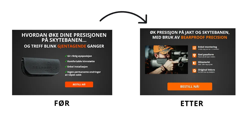
The first version of this headline didn’t work as well. It asked a question and showed the product on its own, and if you’d never seen one, it was hard to tell what it was. After feedback from Knut Bjørgen, the new version says the product’s name outright and shows it on a rifle. Now you understand it in a second.
2. Can I trust them?
Then the page slows down and becomes a personal letter from the founder, Simen Kristiansen. It opens with “Kjære jaktentusiast” (“Dear hunting enthusiast”).
He tells the story in his own words. He wanted his cheek in the same steady spot every time he aimed. A gunsmith could fix that, but it cost too much to do on every rifle, and the alternatives he tried were either fiddly or wobbly. So he made his own.
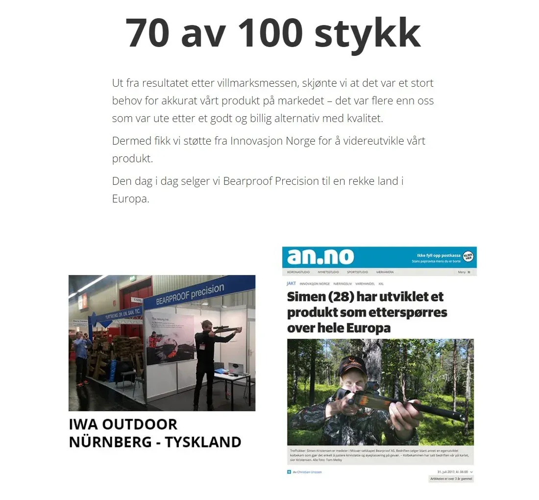
He took the first 100 to a hunting and outdoor fair, not expecting much, and came home having sold 70. That’s the one number on the page set in giant type, because it’s the moment the idea proved itself. Since then there has been support from Innovasjon Norge, a stand at a big international trade fair in Germany, and a feature in the local newspaper.
A list of features can’t do what this story does. It describes the problem the way the reader already feels it. And it puts a real person and real proof behind a brand most people had never heard of.
3. Why not something else?
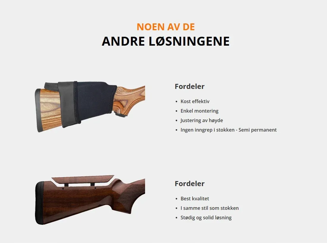
Instead of pretending there’s no competition, the page shows the two usual alternatives: a cheap slip-on cheek pad and a custom solution from a gunsmith. It’s fair about what each one does well. Being honest here makes everything else on the page easier to believe. The reader has also just heard, in Simen’s story, where those alternatives fall short.
Then the product gets its moment, alone on a dark background with its four strengths pointing to it.
4. Is it hard to put on?
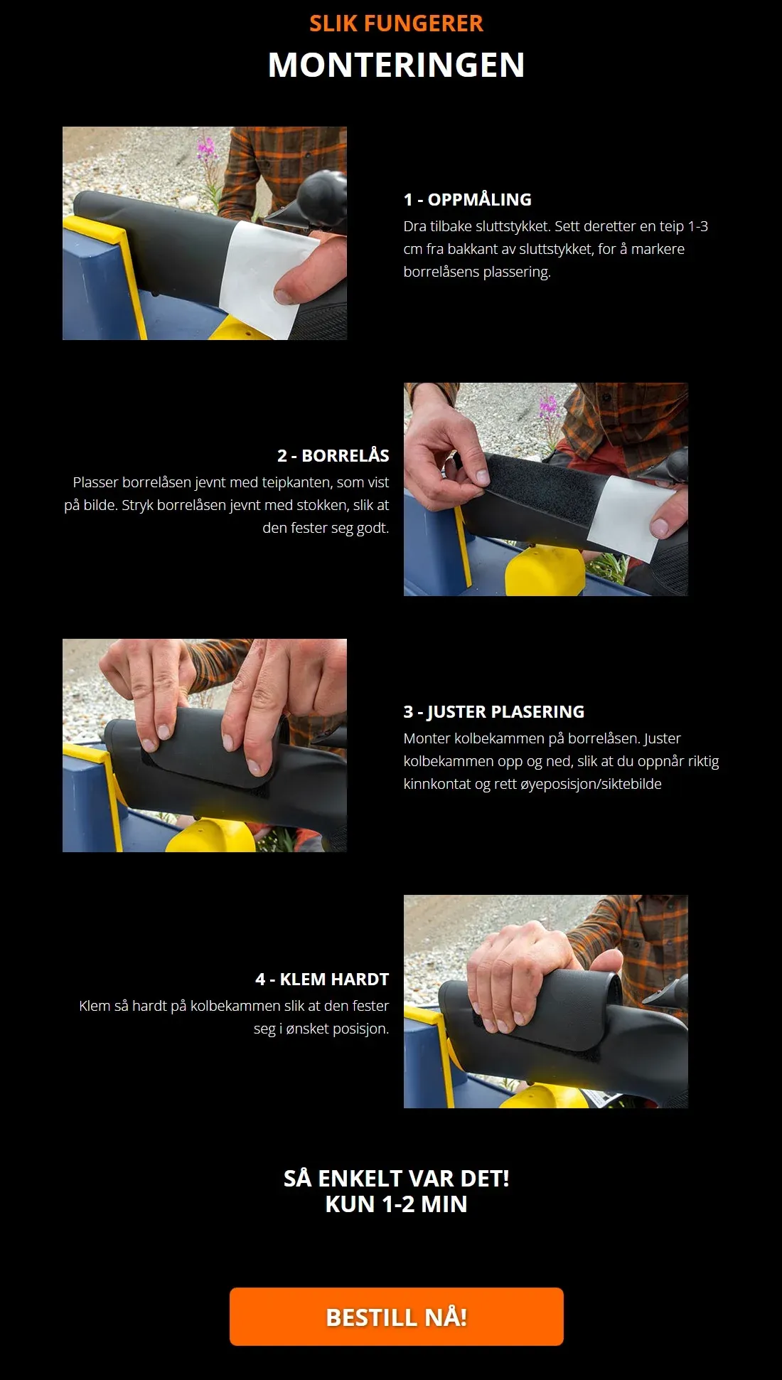
People are careful with an expensive rifle, so this worry needed a proper answer. The page walks through fitting it in four photos: mark the spot with tape, stick on the Velcro, adjust the height, and press it in place. It ends with “Så enkelt var det! Kun 1-2 min” (“That’s it! Only 1 to 2 minutes”) and another order button.
5. What if it doesn’t work for me?
The last worry is risk, so the page takes it away. There’s a 30-day guarantee: if your shooting doesn’t improve, you get all your money back, shipping included, no questions asked.

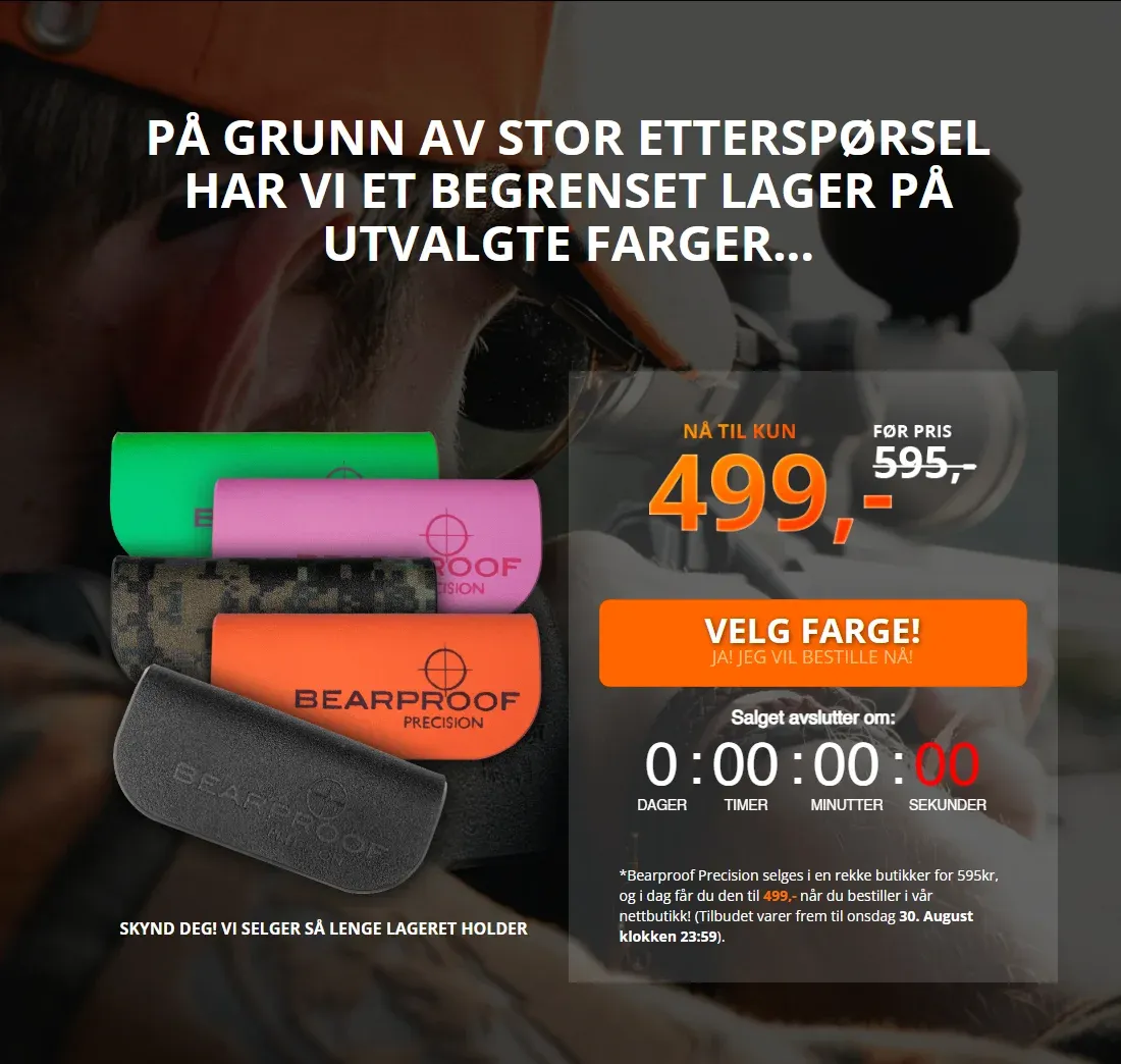
And then a reason to act now instead of “some other time”. Some colours are in limited stock, a clock counts down to the end of the offer, and the price is 499 kroner instead of the 595 it costs in shops.
How it came together
I sketched every section on paper first, then designed it on screen, and built it in Webflow. I wrote the copy as well, in Simen’s voice for the letter.
The look is simple on purpose. It’s dark, like the hunting world it’s made for. Bearproof’s orange appears only on the buttons and the words that matter most, so your eye knows where to go. Headlines are big and bold. The letter sits in one narrow column, so it reads like a letter, not a website. The same orange “order now” button comes back five times, so wherever on the page you make up your mind, it’s right there.
Looking back
Giving one product its own page, instead of sending people into a full store, was the right call. The page has one job: answer a buyer’s questions in the order they come up, then ask for the order.
If I built it again, I’d use a lighter tool than Webflow. It did the job, but a simple page like this doesn’t need everything Webflow brings along.
More from the lab
- 05 FEB 2021 [Client] Bearproof: ~60% Revenue Growth CaseA web store redesign, a dedicated sales page on salg.bearproof.no, and Facebook Ads for the Bearproof Precision launch. NOK 15k in ad spend against about NOK 500k in September revenue.→
- 01 MAY 2023 [Client] Eleni & Chris: Growth & CommerceFull-service media buying and Shopify Plus management for a fast-growing haircare brand.→
- 01 FEB 2024 [Client] Gecko Capital: Document Publishing SiteA lightweight website for publishing company documents, with the server setup and deployment done by me.→
Stuck on a hard technical problem? Maybe I can help.
I take on the occasional advisory job, custom software architecture and research collaboration. There's no sales funnel. You write to me and I answer.