
By Jørn Otto Hansen
In my bachelor’s degree in Business Analytics at BI, one of the term papers gave us a dataset of 7,385 cars sold in Canada. For every car we had the engine size, the number of cylinders, fuel use in town and on the highway, the fuel type, and how many grams of CO2 it puts out per kilometre.
The task was simple to say and harder to do: find out which of these things tells you the most about a car’s emissions, and build a model that can predict them.
For this article I went back to the data. The short answer is almost boring. But there’s a twist I noticed in the paper and didn’t follow up, and it turned out to be the most interesting part.
The average car in the dataset emits 251 grams of CO2 per kilometre. The cleanest is the Hyundai Ioniq at 96 g/km. The dirtiest is the Bugatti Chiron at 522 g/km, more than five times as much. Everything else sits somewhere in between.
(Some models appear more than once, because the same car is listed in several versions and years. The dataset only covers petrol, diesel and ethanol cars, so there are no electric cars.)
The first thing most people would guess is engine size, and that guess is right, up to a point. The more cylinders a car has, the more it emits on average:
Average CO2 emissions by number of cylinders
But if you plot every car’s engine size against its emissions, you see how rough that rule is:
Engine size against CO2 emissions
The trend is clear, but the spread is huge. Among cars with a 2.0 litre engine, emissions go from 110 g/km (a Honda Accord Hybrid) to 288 g/km (a Mitsubishi Lancer Evolution). Knowing the engine size gets you about three quarters of the way to knowing the emissions. That’s useful, but it’s not the answer.
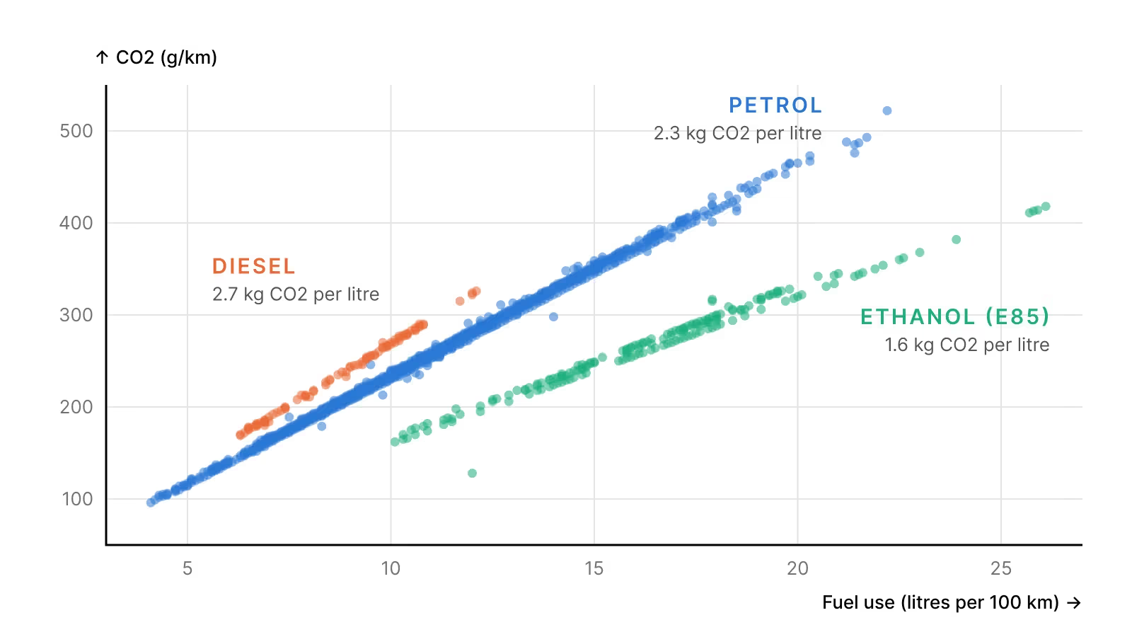
The real answer is fuel use. This is the chart that made it click for me:
Fuel use against CO2 emissions, by fuel type
The CO2 from a car comes from burning its fuel. Every litre of petrol gives about 2.3 kg of CO2, whatever car it’s burned in. So once you know how many litres a car uses per kilometre, you know its CO2 almost exactly. For the petrol cars in the data, the rule is:
For diesel the number is 26.9, and for ethanol 16.3. Engine size, cylinders and car type only matter because they change how much fuel the car burns.
The chart also explains something I got stuck on in the term paper. When I first plotted emissions against fuel use, I noticed the dots formed three separate lines instead of one. I wrote that “a third variable could reveal the underlying group separation”, and left it there.
Going back to it, the answer is fuel type:
One more pattern from the paper holds up well. Cars use about 40% more fuel in town than on the highway, 12.6 against 9.0 litres per 100 km on average. All the stopping, starting and idling adds up.
If you group the cars by type, the order is what you’d expect. Small station wagons and compact cars emit the least, while large pickups and passenger vans emit the most:
Average CO2 emissions by type of car
The second part of the paper asked a slightly different question. Instead of predicting the exact emissions, could a model sort cars into two groups, cleaner and dirtier?
I split the cars at the middle, 246 g/km, so half landed on each side. Then I trained three models to guess which half a car belongs in. One used only engine size, one only fuel economy, and one used both. Here’s how often each one guessed right:
How often each model sorted a car into the right group
Fuel economy alone gets 96 out of 100 cars right. Engine size alone gets 87.
In the paper I picked the combined model as the best, because it scored slightly higher on the statistical measure of fit we used in the course. Counting how often each model actually guesses right tells a different story. Adding engine size doesn’t help once you already know the fuel use, and here it makes the guesses slightly worse. That fits everything above. Engine size is only a rough stand-in for how much fuel a car burns. Once you know the fuel use, engine size adds nothing new.
These numbers only count what comes out of the exhaust. They don’t include the CO2 from making the car, or from producing the fuel. That matters especially for ethanol, whose climate impact depends heavily on how it was made.
This is based on my term paper in Machine Learning and Forecasting (EBA3530) at BI Norwegian Business School, spring 2025. The paper also covered two other tasks on different datasets, which I’ve left out here. The car data comes from the Canadian government’s fuel consumption ratings. You can read the full term paper, with the code, using the button next to this article.
[SYS.03 // ADVISORY.OPEN]
I take on the occasional advisory job, custom software architecture and research collaboration. There's no sales funnel. You write to me and I answer.
NP // NORDICPRODUCTIONS.NO